Mindfield
A mental‑health campaign that uses game‑inspired visual language to reflect the pressure young adults face, making mental wellbeing feel approachable, relatable and easier to talk about.
CLIENT
Headspace
Role
Designer
Service
Campaign Design

Background

Design Solution
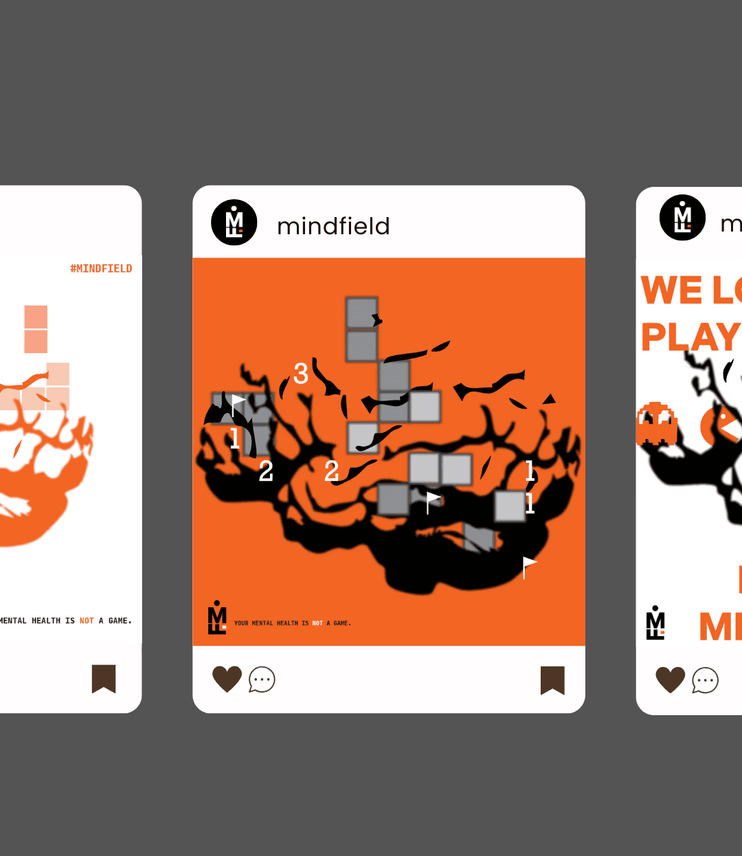
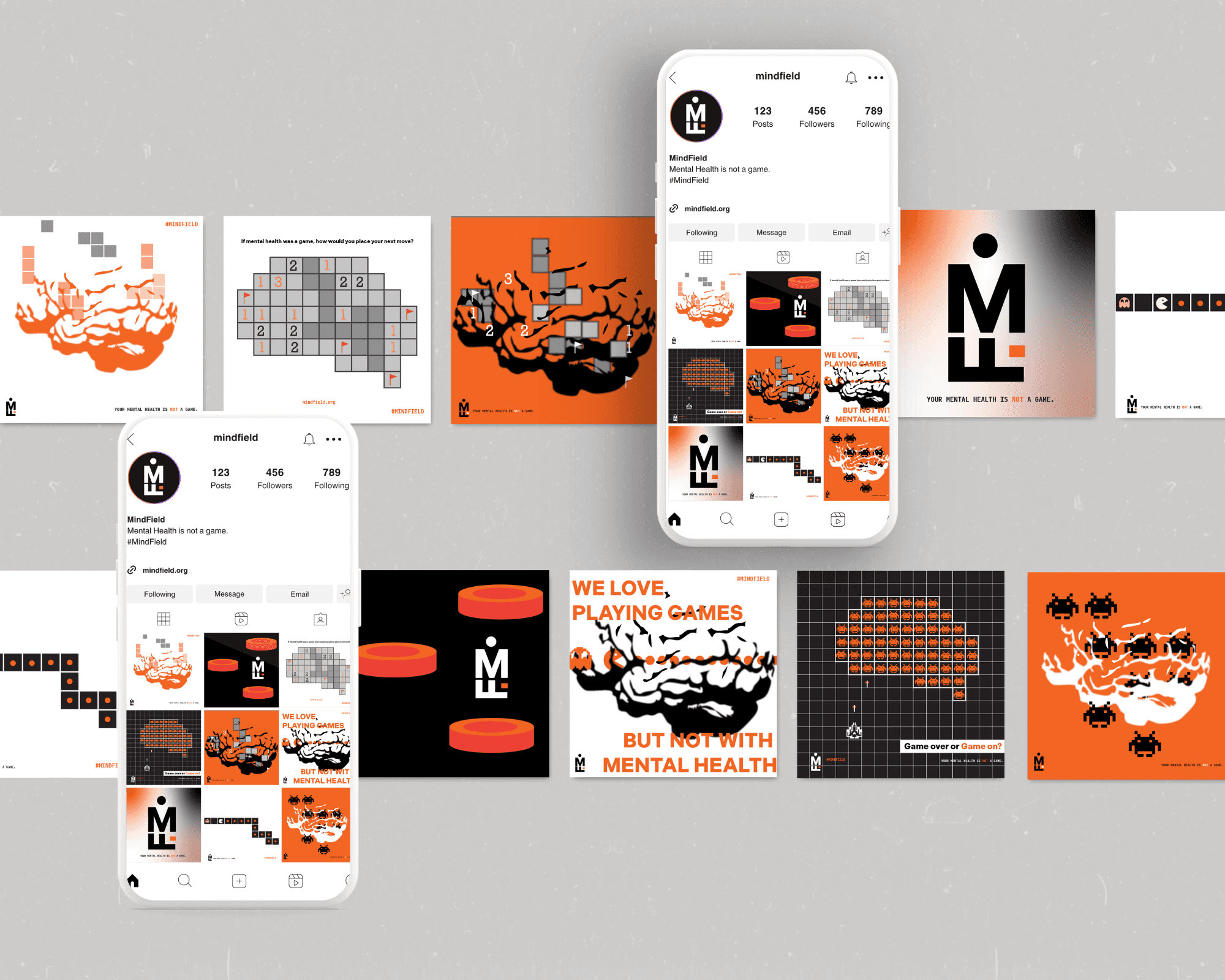
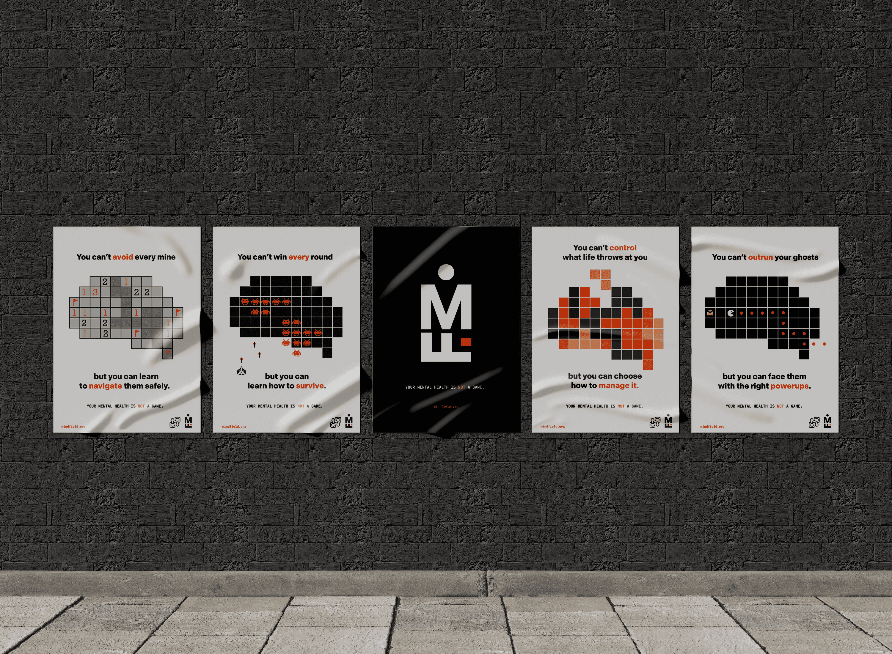
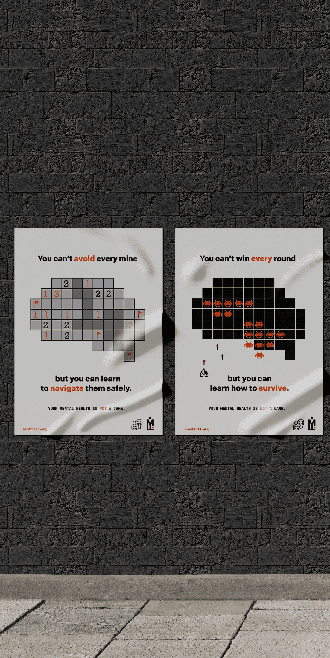
MindField came from wanting mental health conversations to feel normal, not clinical or intimidating. Young adults know mental health matters, but most still hesitate to speak up because of stigma or the pressure to look like we’re coping. The campaign uses a game metaphor because it’s familiar, visual and instantly relatable. It lets me talk about stress, overwhelm and emotional pressure without making the topic feel heavy or medical. Research states that “Over half of young Australians (52%) feel that there is stigma associated with seeking help…”, so the design needed to lower that barrier, not add to it.
The visual identity is intentionally bold and minimal. The Indivisible typeface gives the campaign a strong, geometric foundation that feels serious without becoming clinical, while the fragmented lettering and horizontal breaks symbolise the barriers and unpredictability of mental health. The orange evokes warmth, motivation and action while the black conveys the weight of mental health struggles. The white stands for clarity and openness. The monogram acts as a flexible shorthand, subtly forming a figure holding a mine to reflect the fragility of mental wellbeing. The graphic system draws from recognisable retro games like minesweeper, tetris, pac‑man and galaga, and refining everything around a consistent brain silhouette created a cohesive visual language across posters, billboards and social media.
Tone was just as important as the visuals. The campaign needed to feel conversational and supportive without trivialising the issue. The gaming references are meant to make the campaign relatable but not necessarily funny.
Overall, MindField is built as a youth‑centred system that uses metaphor, minimalism and visual clarity to reduce stigma and make mental health feel safe to talk about. Every design decision supports the campaign’s purpose: helping young adults recognise that seeking support is a strength, not a failure.

A soccer‑festival that uses fast‑paced, competition‑driven visual language to capture the energy of the game and transform it into a vibrant cultural event. The promotional posters translate the festival’s concept of high energy sport, music and community into a bold visual language.
A soccer‑festival campaign that uses fast‑paced, competition‑driven visual language to capture the energy of the game and transform it into a vibrant cultural event. The promotional posters translate the festival’s concept of high energy sport, music and community into a bold visual language.
The key objective of this design was to develop a cohesive visual identity for Lili Lin’s text that conveys the emotional impact of collapsing work–life boundaries through imagery, colour, and visual hierarchy.
Mindfield
A mental‑health campaign that uses game‑inspired visual language to reflect the pressure young adults face, making mental wellbeing feel approachable, relatable and easier to talk about.
CLIENT
Headspace
Role
Designer
Service
Campaign Design
The visual identity is intentionally bold and minimal. The Indivisible typeface gives the campaign a strong, geometric foundation that feels serious without becoming clinical, while the fragmented lettering and horizontal breaks symbolise the barriers and unpredictability of mental health. The orange evokes warmth, motivation and action while the black conveys the weight of mental health struggles. The white stands for clarity and openness. The monogram acts as a flexible shorthand, subtly forming a figure holding a mine to reflect the fragility of mental wellbeing. The graphic system draws from recognisable retro games like minesweeper, tetris, pac‑man and galaga, and refining everything around a consistent brain silhouette created a cohesive visual language across posters, billboards and social media.
Tone was just as important as the visuals. The campaign needed to feel conversational and supportive without trivialising the issue. The gaming references are meant to make the campaign relatable but not necessarily funny.
Overall, MindField is built as a youth‑centred system that uses metaphor, minimalism and visual clarity to reduce stigma and make mental health feel safe to talk about. Every design decision supports the campaign’s purpose: helping young adults recognise that seeking support is a strength, not a failure.

A mental‑health campaign that uses game‑inspired visual language to reflect the pressure young adults face, making mental wellbeing feel approachable, relatable and easier to talk about.