Huddle
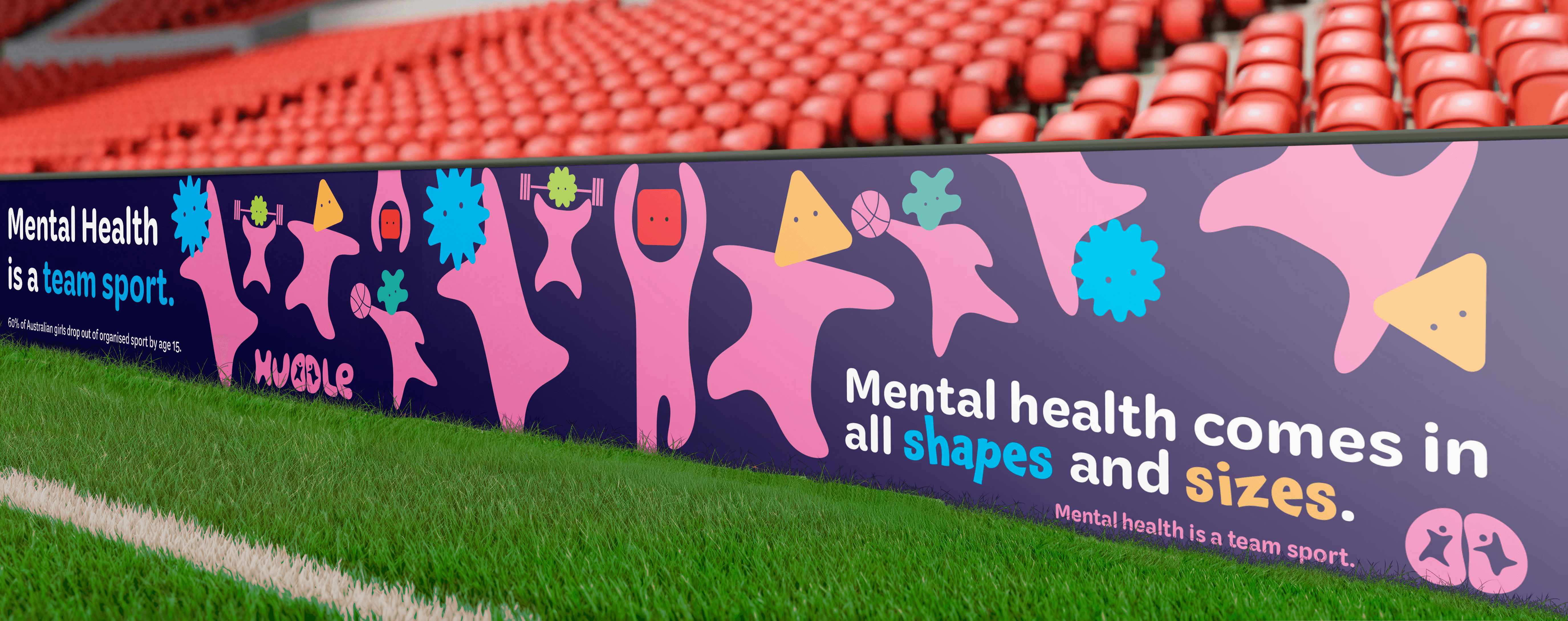
A youth‑focused campaign that reflects the pressures teenage girls face in sport with the aim of creating awareness.The Huddle campaign is built around a simple but powerful idea: the mental pressures that push girls out of sport are real, common, and often invisible. Huddle uses softness, imperfection, and emotional clarity to open a conversation that young athletes can actually see themselves in.
CLIENT
Victorian Institute of Sport
Role
Designer
Service
Campaign design
Background
Design Solution
The Huddle campaign was developed in response to the high dropout rates among teenage girls in organised sport. The Victorian Institute of Sport commissioned this project to address that gap by raising awareness of the mental health challenges affecting girls aged 13–18 and encouraging more supportive sporting environments. Drawing on both evidence and lived experience as an athlete and coach, the campaign uses communication design to make these hidden pressures visible, normalise conversations around wellbeing, and help young athletes feel understood, supported, and able to stay engaged in sport.
The campaign is grounded in the understanding that the psychological pressures driving girls out of sport are often internalised and rarely acknowledged in sporting environments.
The campaign responds by creating a visual and verbal language that feels gentle, empathetic, and non‑confrontational, using softness and emotional clarity to make these hidden experiences visible without overwhelming the viewer. The headline “Feeling out of shape?” introduces a double meaning that invites self‑reflection while remaining non‑judgemental, and the statistic about dropout rates anchors the message in urgency and evidence. Paired with the tagline “Mental health is a team sport,” the campaign reframes wellbeing as a shared responsibility, aligning directly with the brief’s goal of encouraging more supportive sporting cultures.
Visually, the system centres on the imperfect Huddle character, whose soft, rounded form symbolises vulnerability, individuality, and the emotional realities of being a teenage girl in sport. A calm palette, minimal typography, and generous negative space create a sense of emotional breathing room, ensuring the message remains accessible across posters, decals, and social media.
This consistency reinforces the campaign’s aim to normalise mental health conversations and make support feel approachable rather than clinical. By combining emotional resonance with strategic clarity, Huddle positions mental health as something that belongs within sport, modelling the empathy and understanding that young athletes need to stay engaged
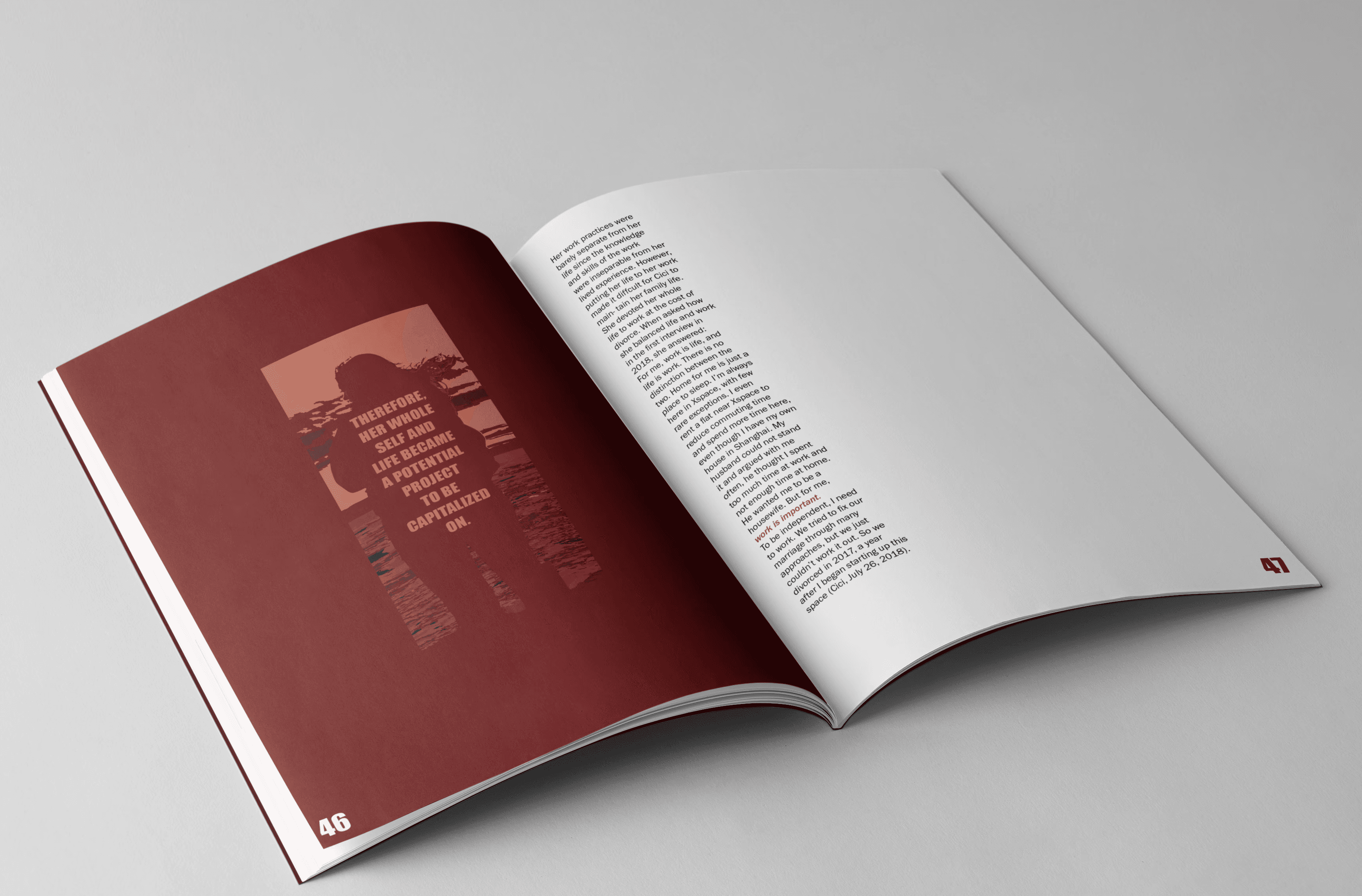
Lili Lin's text was developed into a 64-page monothematic publication exploring work–life boundary collapse and workplace pressure. The seemingly unfinished and distorted image making technique portrays discomfort and a sense of being monitored to the reader. This deliberate style shows how work and life can suffer under immense pressure.
Lili Lin's text was developed into a 64-page monothematic publication exploring work–life boundary collapse and workplace pressure. The seemingly unfinished and distorted image making technique portrays discomfort and a sense of being monitored to the reader. This deliberate style shows how work and life can suffer under immense pressure.
MindField


Huddle
A youth‑focused campaign that reflects the pressures teenage girls face in sport with the aim of creating awareness.The Huddle campaign is built around a simple but powerful idea: the mental pressures that push girls out of sport are real, common, and often invisible. Huddle uses softness, imperfection, and emotional clarity to open a conversation that young athletes can actually see themselves in.
CLIENT
Victorian Institute of Sport
Role
Designer
Service
Campaign design
The Huddle campaign was developed in response to the high dropout rates among teenage girls in organised sport. The Victorian Institute of Sport commissioned this project to address that gap by raising awareness of the mental health challenges affecting girls aged 13–18 and encouraging more supportive sporting environments. Drawing on both evidence and lived experience as an athlete and coach, the campaign uses communication design to make these hidden pressures visible, normalise conversations around wellbeing, and help young athletes feel understood, supported, and able to stay engaged in sport.
The campaign is grounded in the understanding that the psychological pressures driving girls out of sport are often internalised and rarely acknowledged in sporting environments.
The campaign responds by creating a visual and verbal language that feels gentle, empathetic, and non‑confrontational, using softness and emotional clarity to make these hidden experiences visible without overwhelming the viewer. The headline “Feeling out of shape?” introduces a double meaning that invites self‑reflection while remaining non‑judgemental, and the statistic about dropout rates anchors the message in urgency and evidence. Paired with the tagline “Mental health is a team sport,” the campaign reframes wellbeing as a shared responsibility, aligning directly with the brief’s goal of encouraging more supportive sporting cultures.
Visually, the system centres on the imperfect Huddle character, whose soft, rounded form symbolises vulnerability, individuality, and the emotional realities of being a teenage girl in sport. A calm palette, minimal typography, and generous negative space create a sense of emotional breathing room, ensuring the message remains accessible across posters, decals, and social media.
This consistency reinforces the campaign’s aim to normalise mental health conversations and make support feel approachable rather than clinical. By combining emotional resonance with strategic clarity, Huddle positions mental health as something that belongs within sport, modelling the empathy and understanding that young athletes need to stay engaged
The publication is designed as a disciplined editorial piece that mirrors the tensions in Lin’s article. I use a stable academic framework, wide margins, and a strict hierarchy to create clarity and breathing room around dense sociological content. This structure gives the book a controlled, institutional tone, which I deliberately contrast with moments of disruption to reflect the lived instability described in the research.
Throughout the book, abstract symbols and fragmented visual elements interrupt the clean layout at key thematic points. These aren’t illustrations; they act as conceptual markers that echo ideas of pressure and blurred boundaries between life and work. The result is a publication that holds two modes at once: ordered and unsettled. It functions as both a scholarly document and a designed artefact, using rhythm, space, and disruption to extend the meaning of the text.
Lili Lin's text was developed into a 64-page monothematic publication exploring work–life boundary collapse and workplace pressure. The seemingly unfinished and distorted image making technique portrays discomfort and a sense of being monitored to the reader. This deliberate style shows how work and life can suffer under immense pressure.


